Wild Fang Redesign
Data ➝ ideation.
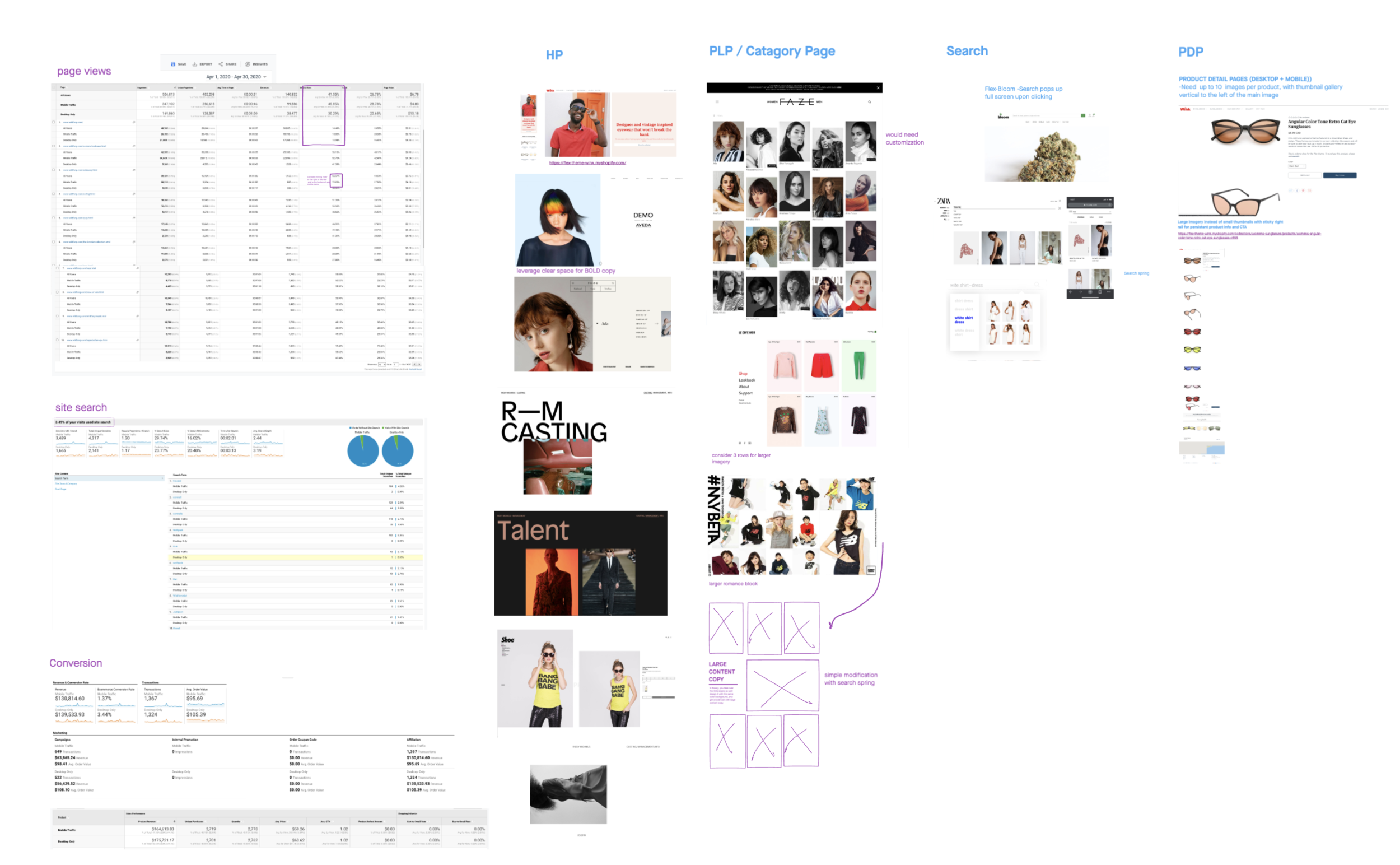
Data driven creative, informed by Google Analytics, followed by collaboration between UX/UI and the client.
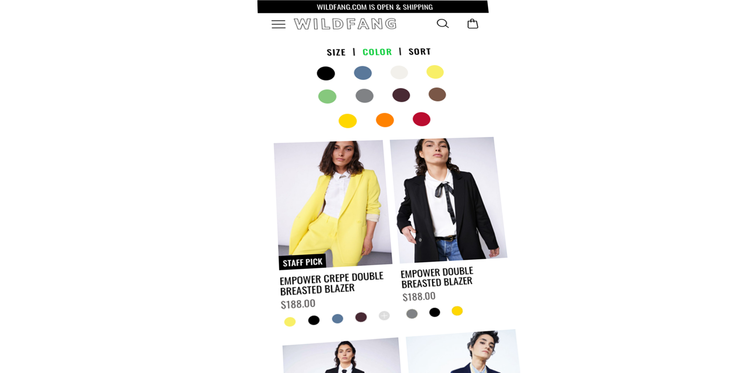
Through our research, we learned that the Wild Fang consumer were keen on filtering by color. So we elevated the color swatch on the PLP to show at a quick glance, which products came in what colors. Simple solution, and simply executed.
Truly Mobile friendly filtering system
We paid attention to the fact that all too often, navigational elements force the user to stretch their fingers, use two hands, making for a more labor intensive experience. We mitigated this by purposely running the top color filter only 4 columns wide, bringing a 3rd row down even further into the sweet spot of finger tapping and swiping.
A Simple solution with big impact
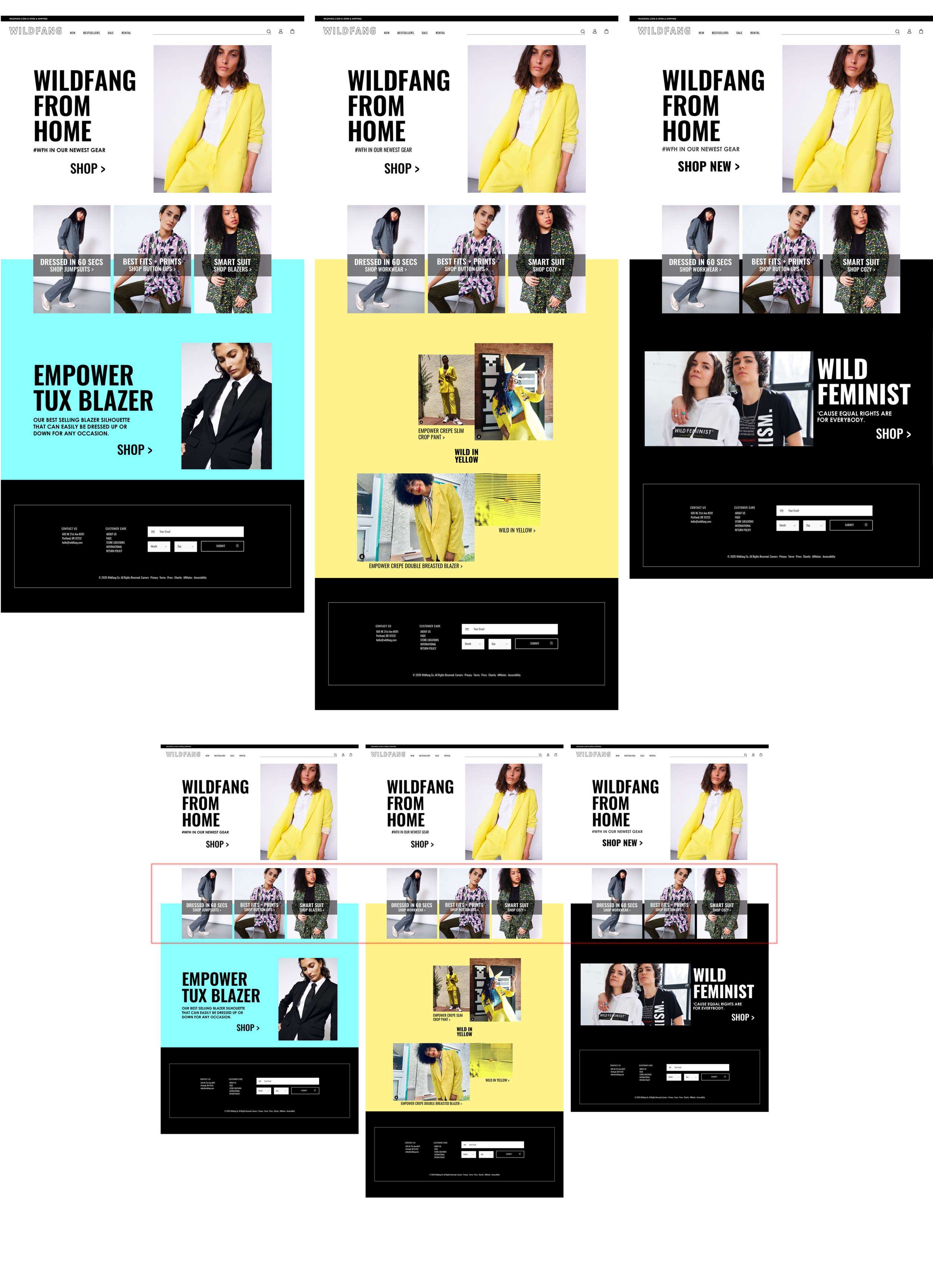
Our client wanted the ability to effect their site post launch for events, holidays, product launches etc.
We kept this in mind as we moved into our UX/UI design phase by approaching our layout as modular blocks, allowing for easy adjustments of the HTML color scheme to either create either cohesive blocks of content, or separate them out for various tauts.
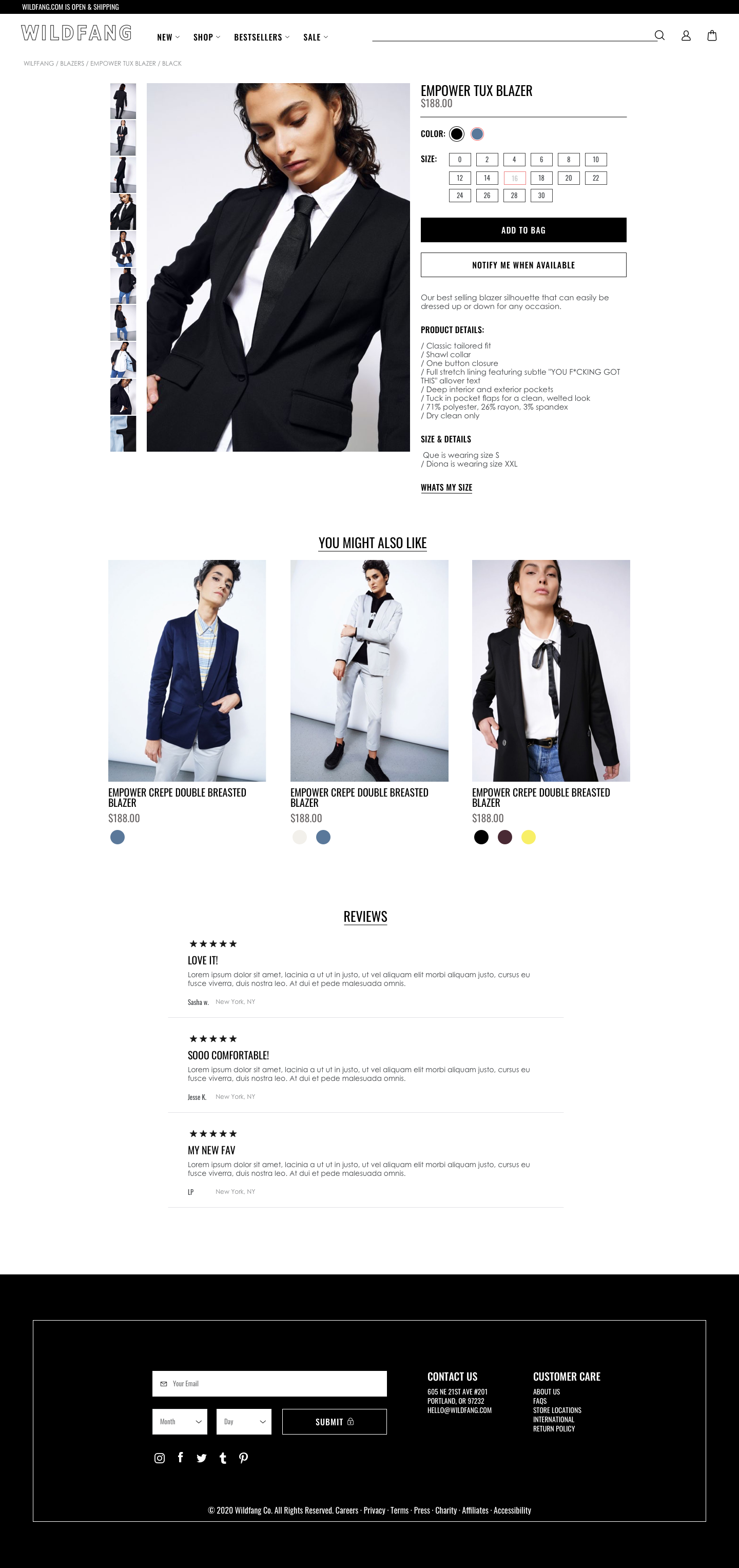
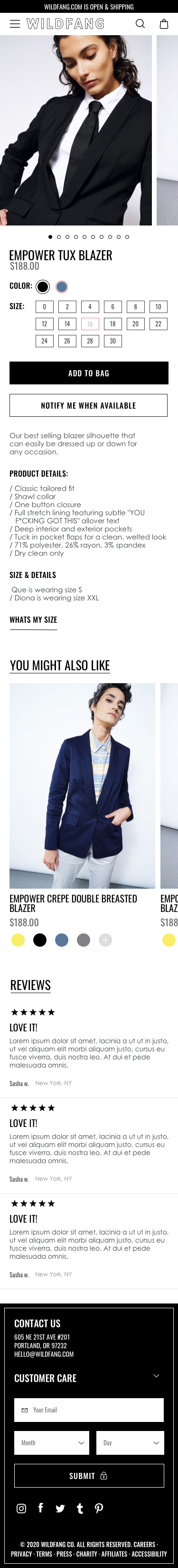
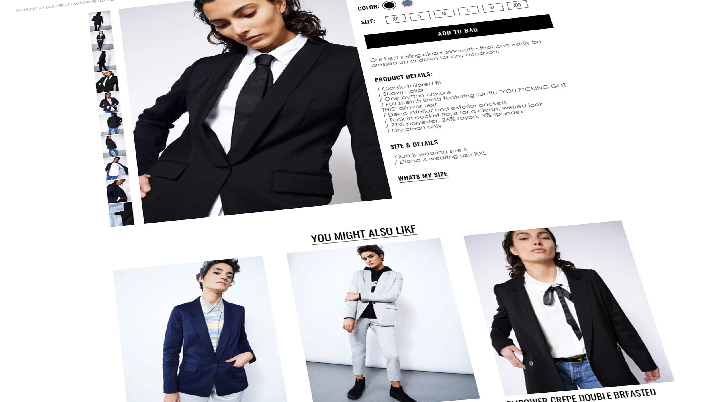
Product detail page. It is in the details.
What do you mean its out of stock ??? It happens, but we can mitigate the disappointment, and still up our chances for sale. By leveraging Klevu, if a product of their interest was out of stock in their size or color, they would be greeted with a “Notify me when available” CTA. The user would be emailed when said product is back in stock.